Company Blog
Fully Responsive Website
Posted by Gray Wood in News on November 13, 2013 with No Comments
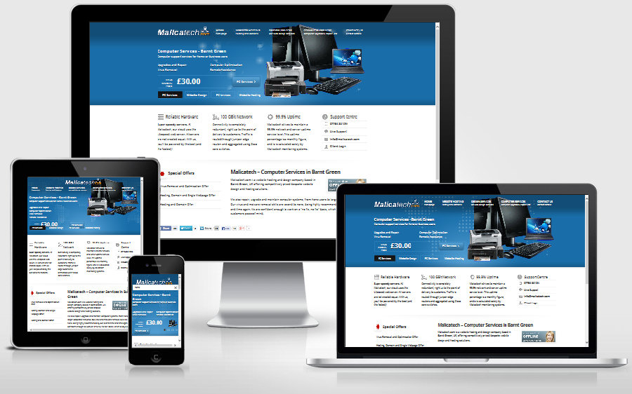
The malicatech.com website is now fully responsive. The original design, which looked great on a full-size monitor, was difficult to navigate on a device with a smaller screen, like a mobile phone for example.
Now that I’ve made it responsive, the website dynamically adjusts to fit into any display on all devices. This is accomplished by setting presets in the style css file. When viewed on a mobile device, there is no room to dispay a full horizontal menu. So the website generates a select drop-down menu instead. It can now be viewed comfortably on a full-size monitor, a laptop, a tablet, and a mobile phone.
Comments are closed.
